
Role
Function
Timeline
Overview
Good Times Planner is a new platform looking to establish an intuitive digital experience for travelers who want to seamlessly plan travel itineraries together as a group while aligning on trip specifications and discovering personalized experiences.
Challenge
Due to variability in planning participation and preferences regarding trip specifications, group travelers need a way to align the individual preferences of tripmates so that they can collaboratively plan a personalized experience.
Solution
Develop and design a collaborative travel planning platform where users can align on trip specifications as a group, discover personalized experiences, and create lists or itineraries to plan out their trip.
Market analysis
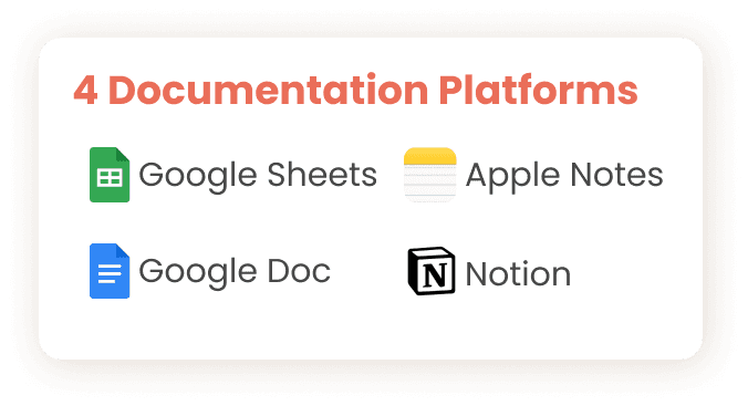
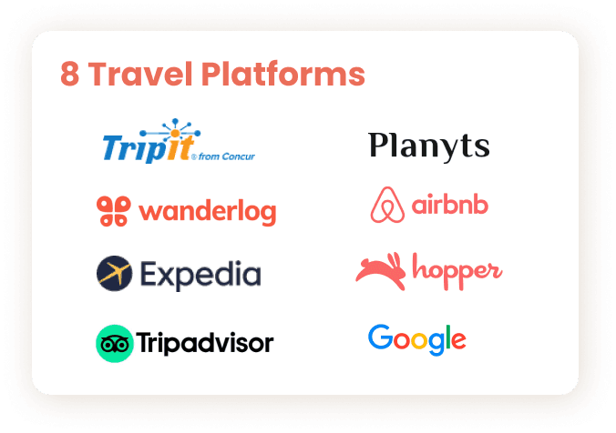
We conducted competitive analysis of 8 travel websites to gather insights on their design strategies and best practices in the travel industry. We also conducted comparative analysis of 4 documentation platforms to analyze functions and features that might make sense for a travel planning platform. We wanted to learn what was working for other companies and what wasn’t working.

Gap in the market
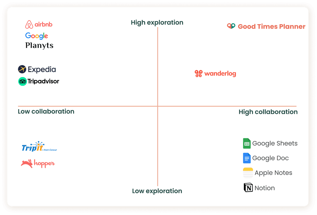
We wanted to define any possible value gaps within the market. Given our exploration vs. collaboration matrix, its clear to see that most platforms excel in either category but rarely excel in both.
This gap in the market leads travelers feeling frustrated by a disjointed process of planning because each platform specializes in only 1 to 2 aspects of the trip experience. For example, using TripAdvisor for activities and food and Google Travel for flights and itinerary.
We feel that Good Times Planner can fill this gap in the market by prioritizing both high exploration and high collaboration in its design.
Finding the right users
We created a screener survey to acquire potential interview participants. Of the 45 responses we received, we interviewed 12 ideal users. The ideal users had traveled in a group of 5 people or more, at least 3 to 5 times a year, and used different travel websites during planning.
Although a wide variety of topics were covered during the interviews, we identified 3 main pain points:
Pain point #1:
Collaborating with trip-mates and receiving low engagement
Users mentioned frustrations when friends and family don't bother to engage in the planning process. Unanswered texts or unread messages often led to miscommunication and a less than ideal travel experience.
Pain point #2:
Misalignment of preferences or goals for the trip
Getting everyone to engage in the planning process is hard. Knowing how everyone feels about where to eat or what to see can be even harder. Users mentioned the experience of planning everything just to have trip-mates raise concerns or dissatisfaction at the destination.
pain point #3:
Too many disconnected sources
Users felt tedious having to switch between different platforms to perform different tasks. The need to do research on one website and book reservations on another often contributed to frustration and can lead to wider miscommunication amongst the group.
45
survey participants
12
user interviews
18-45
age range
Persona development
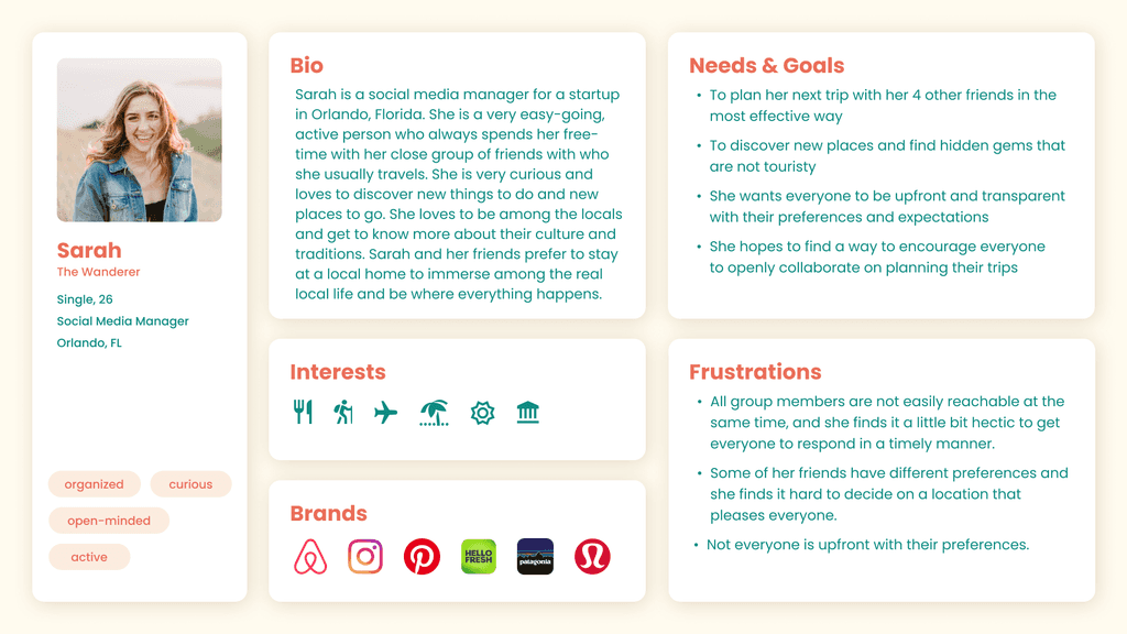
After synthesizing the research and findings from our user research, we created two proto-personas including a primary proto-persona to better visualize and understand the issues of our users.
Meet Sarah, the wanderer. We referred to Sarah throughout the product development and design process to always keep our users in mind.
User journey
After developing our primary proto-persona, we considered the user journey that Sarah would take as part of a group planning their trip together.
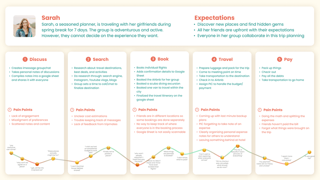
In the discuss stage, Sarah is struggling to keep track with scattered notes and different preferences being shared.
During exploration, the information online is too spread out and the cost estimation is difficult to calculate. Additionally, some tripmates are not proactive and are delaying booking opportunities. In this case, Sarah constantly asks herself, “why won’t anyone respond? I hope they pay me back for this shared Airbnb.”
Finally after deciding to go Puerto Rico, Sarah is having a hard time keeping track of who has booked their flights - who is staying in the same lodging as her - and who is opting out of certain activities.
During travel, Sarah enjoys herself but worries about remembering payments, and coming up with backup plans if things got cancelled.
After returning home, Sarah struggles to calculate her expenses and receive outstanding payments from friends. All in all, she feels it was a good trip but with too many bumps in the road.

We asked ourselves in what way to approach the pain points at hand and came up with 2 main questions:
How might we encourage users to be more proactive in trip planning?
How might we help users explore the best experience possible for their group?
Proposed solution:
Design a single collaborate travel planning platform where users can align on trip specifications as a group, discover personalized experiences, and create lists or itineraries to plan out their trip.
Design considerations
To achieve our goal, there were some specific features to consider based on the pain points that we've conovered:
First, we needed a way to gather preferences of individual tripmates in order to compile and present them in a way that is clear to the entire group, leading to awareness and honesty.
Second, the website must present content specifically to meet the needs and preferences of the entire group. This helps travelers create a trip experience that suits everyone while preventing them from getting overwhelmed.
Third, we needed a way to increase engagement and timely responses while minimizing effort.
Fourth, we needed a way to allow travelers to easily access relevant conversations and suggestions.
Lastly, the website must be able to represent all the trip information and possibilities that would be most helpful to ease the frustration of switching between travel platforms and documentation platforms.
Pen to paper
Given the design considerations, we conducted a design studio and began sketching as a group to put our ideas on paper and have a solid direction when diving into mid-fidelity wireframes. We discussed our ideas to help refine our solution.

User flow
We created user flows to help us align our visual layout with our design considerations. The user flow highlights the journey the user would take from onboarding to finalizing the details of the itinerary.

Mid-fidelity iteration
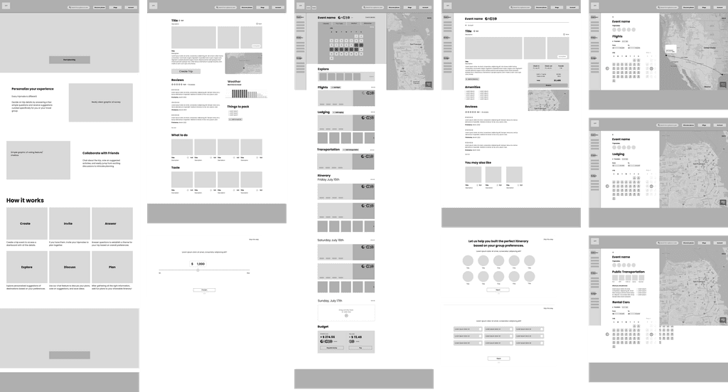
It was then time to bring our user flow to actuality with mid-fidelity wireframing. We decided to focus on building out the main pages of our user flow. Wireframing allowed us to make iterations through many design considerations quickly and provided a visual anchor when having conversations with the client.
Home page with main CTA and introduction of the platform
Location details page
Comprehensive dashboard
Pages for flight, lodging, transportation
Survey for individual preferences
User testing
We used wireframes to conduct usability testing to validate our design decisions. We wanted to make sure that
the purpose of our product was clear,
the user flow was intuitive,
and the content met the expectations and needs of our users.
We introduced the following scenario to our users:
“You and four of your friends are planning a trip from July 15, 2022 to July 22, 2022 but your travel party is unsure of a destination. You know everyone likes hiking but you don't know how much experience people have, what other activities they want to do, and what form of transportation they’d like to take. Given these conditions, show us how you would plan your trip using this platform”
Then we asked follow up questions such as:
How would you manage collaboration using this platform?
What do you expect to see on this page?
8
user test groups
100%
positive experience
3
considerations
1st change: purpose
The first main change was our homepage banner. The original banner was too large that users did not scroll to the “How it works” section below and instead, focused on the banner of the top navigation.
During usability tests, users had a general idea of the purpose of our product, but all users said it would have been more helpful to see the “How it works” section before moving forward.
To resolve this, we made the banner smaller in height, and moved “How it Works” section right below so it is visible when users land on the homepage.
Before
Highlighted collaboration features above.
How It Works section with product instructions and purpose below.
After
How It Works section clearly represented as step by step instructions.
Highlighted features below.
2nd change: flow
Secondly, we originally had a pop-up survey that users would have to take immediately after creating a trip event to set their preferences.
During usability testing, we discovered that this pop-up was considered intrusive, and users did not understand why they had to answer a survey before viewing their dashboard. This prompted us to reconsider our user flow and the many ways a planner, an invited tripmate, or a casual website visitor, would be onboarded on the platform.
Our solution was to create a more organic way of gathering data with the use of voting in the familiar format of icons.
Before
The pop-up survey to gather data was considered intrusive, overwhelming, and confusing.
After
Natural, less obstructive way of collecting preferences of individuals.
3rd change: expectations & needs
The third main change we made was on the dashboard, in particular the flights section.
Originally, this section was going to show a single users’ flight and the avatars would indicate who had or had not booked a flight yet. Users would have had to click on the avatars or the menu to see more information about everyone’s flights.
However, after testing, it became clear that users expected the dashboard to be a group view and wanted to be aware of all the progress made by each individual tripmate.
Before
Dashboard only included the user’s flight.
The profiles on the side were clickable to show each tripmate’s individual information.
The grayed out profiles were the tripmates who did not complete bookings yet.
After
Dashboard includes all tripmates information.
The profiles on the side indicate who has completed each action.
Style guide
Here are the UI elements we have considered when designing the Hi-fidelity interactive prototype.
We chose this shade of red as a primary color, because red is associated with excitement and passion. It adds gravity and heightens awareness. It is also stimulating, and prompts curiosity and desire to travel and discover.
For the secondary color, we chose this shade of green because it is associated with the environment and outdoors, making it a natural choice to suggest nature and travel. Green is the most balanced of colors, making it an ideal complementary color to red.
For typeface, we chose Poppins as it is a modern geometric sans serif typeface. It is often used for styles that are playful, modern, natural, professional.

Next steps & recommendations
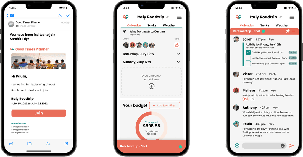
Although our primary focus was on a website application, during our testing, users mentioned wanting a mobile version of Good Times Planner.
From our user research, we uncovered that a majority of our users wanted access to their dashboard on the go. In situations when they might not have access to internet or GPS, our users would benefit from features such as offline maps and a downloadable itinerary.
Therefore, as next steps, we recommend exploring a mobile application to further streamline the user’s experience in terms of collaboration, communication, and accessibility of information.
This was a challenging yet fun project. It was great being able to work with such a dynamic team and be able to handoff our final deliverables successfully to our client. This project required a lot of up front user and industry research and strategy before finding the right approach to meeting user needs and business goals. Coming prepared with thorough and digestible research findings to validate our recommendations and design decisions to present to our client was imperative to developing and designing a meaningful product that met business goals while prioritizing user needs.
Scope of work
When digging deeper into new research findings, it can be easy to lose sight of the original deliverables. Having a scope of work that’s clearly outlined and defined helped keep us on track and ensured we met each milestone along the way and successfully handoff our final deliverables to our client.
Client relations
Strong and positive client relations allows our team to connect with our client on a much more personal level. Going the extra mile to build empathy not only for the user but also for the client and business allows us to develop a deeper understanding of their needs and goals, thus creating a sense of mutual understanding.
Purposeful design
A truly effective design should have purpose and meaning which allows it to achieve the optimal balance between function, communication, and aesthetics. It should not only look good but also can deliver the intended meaning of the design effectively and clearly. We should take a holistic view to explore and consider all of the elements that the design touches within its ecosystem.
I was blown away by the level of detail, care, and creativity Ray had while working with his team…He listened to my initial goals and ideas, used diligent research and collaboration, kept me included and informed along the way, and brought a passion into his work…


